Indel Money Unveils New Logo Signaling Strong Growth, Bright Future
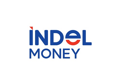
Indel Money, the flagship non-banking finance company (NBFC) of Indel Corporation, is excited to announce a significant rebranding initiative, including the unveiling of a new logo. The rebranding signifies the company’s dedication in building trust and doing business with utmost integrity.
The new logo presents bold colors and symbols that embody the core values of Indel Money. The color Blue symbolizes trust and integrity, while Red highlights the warmth and approachability the customers feel across all the touchpoints when they interact with the company. The upward arrow within the logo represents Indel Money's current growth, and the smile symbolizes the care and positivity the brand exudes in all business dealings.
Indel Money, a conglomerate with over Rs 2,500-crore AUM and a turnover exceeding Rs 1,000 crore, continues to register a strong growth in the current fiscal year and runs 320 branches across 12 States and 2 Union territories. This rebranding is also a testament to the company’s commitment to reach out to new customer segments and serve them better.
About the rebranding, Umesh Mohanan, ED & CEO of Indel Money, said: “We are committed to being FASTER, STRONGER, BETTER in all the aspects of our business, and our rebranding initiative clearly reflects this vision. We are not just changing our visual identity, but making a bold statement about our commitment to trust, integrity, and customer-centricity. At Indel Money, we are passionate about providing positive experiences and care to our customers, and our new branding reflects this promise.”
Above views are of the author and not of the website kindly read disclaimer
